Welcome to MY STUFF ROOM - a space for my collection of STUFF ... STUFF GALORE ... GALORE-IOUS STUFF! ... INSPIRING STUFF I find online, and maybe even some STUFF I create myself. It's all Stuff that makes for a Creatively Galore-ious Day! ... Thanks to all who share their talents! I love to see it ... it truly inspires.

Thursday, September 19, 2013

Main Bath - part 5 - Completed

I am so happy to announce ... FINALLY ... that our main bath redo is reDONE!

For many years our bathroom looked like this ...


then the wallpaper was removed ...


And more work was done, little by little ...
and now today the bathroom looks like this ...


Today's look at the main bath redo using my TO DO list ...
You'll see that each thing has been crossed off (maybe even changed a bit from the first and original list).
The purple words give a short bit of info - color choices or places we purchased each item.
 

TO DO:
 
- stronger ceiling fan,
- paint fan cover = I broke the old one so we had to replace it
We used parts and pieces from what we previously had from replacing the motor in fan.
(We didn't use the new cover piece when we originally replaced the motor, because it wouldn't fit the old box. Since I broke the old cover trying to replace it after painting it I had to go to plan B.  We drilled small holes in each corner of the new cover and screwed the cover directly into the ceiling.  My husband got to help with that job - lucky guy huh, I break the old one and he has to repair my mistake - he's familiar with that type of thing - poor guy!)

- remove wallpaper, (see this post)


- paint ceiling, 
Ceiling paint color is Valspar Spring Parade / Glossy.
- repair ceiling above shower and paint it, 

- paint walls,
Main wall color is Valspar Playful Petal / Satin Gloss,
and the darker color on the two accent walls is Valspar Purple Hills / Satin Gloss. (we really like this color)

- caulk around tile at shower and tub,
- replace broken tile at tub/floor area, (I broke one removing the baseboard.) 

- remove baseboard,
- sand and paint baseboard and window frame,
- replace baseboard,
- paint inside side of the door,
Trim color is Valspar Homestead Resort Jefferson White / Satin.

- put trim on floor in front of tub to help hold flooring in place,
This made a bit difference in the look, and we are happy to have done it.   It's just a small piece of PVC trim purchased from Lowes, and cut to length. We glued it down instead of screwing or nailing it in.  We wish we had done this when it was new.  The vinyl was installed after the tub, so there was a raw edge.  It was caulked, but with time and some water damage over the years it has peel up in places. This trim might have helped if it had been there from the beginning, but it definitely helps hide the ugly edge of the vinyl today. 


- paint sink cupboard white(ish),
Cupboard color is Valspar Hotel St. Francis Clay Angel / Satin Gloss.
- finish wax cupboard,(tried it - didn't like it, painted over it)
- put handles on cabinet drawers and doors,  
Drawer and door pulls on the sink cupboard are clear glass on brushed nickel, from Home Depot.

- paint the mirror was changed to remove and replace mirror,
Mirror purchased from Lowes.
 
- remove old sink,
- replace sink,
- replace faucet,
- replace back splash changed to replace countertop,
Faucet and Sink/countertop/backsplash combo purchased from Lowes.
 
 before ...
 
 
after ...


- tall stand beside sink 
Moved the unit I had in my entrance hall to the bathroom, after painting it  purple - see more info on this post.


- remove built in cupboard at shower wall
- place a cupboard/shelving unit at shower wall to store towels and misc, 
Used the pie safe I had in my kitchen. It was a dark stained wood, but we painted it blue (and we now refer to it as the towel cupboard) - see more details in this post.

before ...


now ...


- replace ceiling light, 
Ceiling light purchased from Lowes (after several attempts with other options from Lowes and Home Depot).  This light is an LED and requires no light bulbs.  It brightens the room and seems to be working great, we'll see how long it lasts and how we like it.
 
- replace light over mirror,
Light over mirror purchased from Lowes. 


- remove towel rack,
- purchase something like a quilt stand rack for the towels,  
Towel stand purchased from Amazon. (You might notice a package on the bottom of the stand - it's another shower curtain we liked, and we will change it out when this one gets bad.  We had some fun shopping one day!)  The pretty towels were given to us from a good friend when she learned about our bathroom redo.


- new floor mats 
Rugs by toilet and shower are a two piece set purchased from Fred Meyers,
Rug under the blue pie safe cupboard is a sweater rug previously shown here, purchased from Ross,
Rug in front of sink purchased from Ross also previously shown here, folded in half to make it the right size - that means that when it gets dirty, we can fold it over and get four different uses out of it. ;)  We do have a rubber mat underneath it to help hold it in place.
 
- new shower rod and curtain, 
Shower rod and curtain purchased from Walmart. (used the same hooks we had.) 
 
- new window covering,  
Standard size blinds purchased from Lowes, and mounted on the outside of the trim because they were too large for the inside. (I prefer inside mount, but choose to forego, since I was not wanting to spend more time or money on special order blinds. Haven't I spent enough time already?)

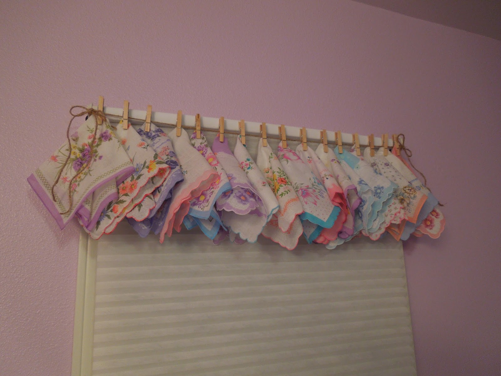
Valance is Vintage handkerchiefs (pinned onto sisal twine with small clothes pins, and the sisal twine was tied to a hook I screwed into each end of the window frame). I had purchased these hankies on Ebay at least a year ago (maybe two), and I brought them out of My Stuff Room storage since they seemed to be a perfect fit for this room. We love it!  (I had all the other parts and pieces for this valance in my craft supplies.)


- small stand under window
Stand under window was purchased at Ross - painted it pink, distressed and waxed it, put the toilet paper roll holder on the side of it, and placed it into position.  Doesn't it make a great toilet paper holder?  I think so!  See this post for more details.


The black looks pretty good against the purple in this photo above, but it didn't look good with the overall look, so we painted it pink.  The pink doesn't look as nice against that wall, but the stand looks a lot better in pink.  Maybe someday I will consider distressing it a bit more, but my arms were getting pretty tired and I was ready to be done, so I stopped as it is.
We do like it, and it fits a few of our favorite things quite nicely.
 
The picture and bowl was made by my aunt and given to my grandmother years ago.  It used to sit on top of our built in cabinet (you can see it in one of the photos above), but looks much better down low on this pretty pink stand, and stuffed with more vintage hankies.
 
 
The item on the middle shelf is a blue blanket I purchased a few months ago (because it was beautiful, and on a great sale, and I knew I could enjoy using it somewhere - little did I know it would be in the bathroom).  It fits perfectly there, crowned with a tray of leftover hotel lotions and a few other supplies. 

 
The cute sheep on the bottom shelf was resting in the family room until we decided it would look nice on this shelf.


- replace electrical switches and outlets (and covers) with white,
 Great looking outlet covers purchased from Lowes (a bit more costly than the original, but very nice looking - and I only needed three).
 
- accessorize!*

*Small stand in front of towel cupboard was purchased from Goodwill and painted pink.  (I don't know if it's a phone stand or a plant stand or what it's original purpose was, but it was $4.00 and I knew I could come up with a good use for it, though I was thinking of reception décor when I purchased it.) See this post for more info.


*Garbage can purchased from Lowes.

*The picture of mother and child was on the window wall before the redo and is back on that wall now, but I painted the frame the same color as the trim. More info here. (I found another photo of the bathroom from the past with this picture frame visible in the dark brown color. The old fan cover is also visible, as is the shower curtain that we removed and did not replace, and a bit of a shelf can be seen to the left of the sink that was also removed and replaced with the purple cupboard.)


*The mirror frame with the three flower hooks is something we have had for many years, hoping to use it in my daughters room, but it never seemed to work and I could never get rid of it. We brought that out of storage, painted it blue (chalk paint), distressed and waxed it, then added some awesome colored jewelry that we had stashed and stored. More info here.


*The three white and crystal canisters, previously shown at the end of this post, were from Ross. Purchased before the remodel began - but the idea was brewing.
 
*Rug hanging over towel cupboard door was a rug that my mother-in-law had.  I didn't want to use it on the floor and ruin it, so it had been folded up and laid on a trunk or wooden crate for décor.  It fit perfectly here, so we gave it a new home. Love the colors, and that we can now see it better. 

*Shelf above toilet was reddish/brown in color and was in that place before the redo. See more info here.  I painted it blue (chalk paint) and distressed and waxed it and replaced it. 


*Sheep (for our baaath) and most other décor in small shelves were there previously too, or in other locations in the house.


*Small picture on the wall (left of the purple stand next to the sink) was previously on the wall by the light switch (just coming into the room) - I just changed the placement of it, keeping it in the room.

*Flowers (beside the purple stand next to the sink) have been used in the family room or in the entrance hall.  I washed them and now they live in the bathroom.

*Black wall hook for the hair straightener was something I purchased a while ago, possibly from Joann's or Craft Warehouse.  I wasn't using it at the moment, so we put it on the wall. We talked of painting it, but didn't get it done, so maybe we'll just leave it.

*Purple vase on tub was purchased for a display I did several years ago and it's just been kickin' around from room to room or storage cupboard to cupboard for years now.  It has finally been able to come out of hiding to find a new home. 


Other things were brought into the room to help complete the look we wanted.

*I received the tier on the countertop as a birthday gift from one of my kids and it fit so nicely in this room, filled with a few everyday items.
  
*One little purple suit case, first seen here, found it's way into the bathroom and was stuffed with vintage hankies.  Surely you have noticed the vintage hankies everywhere in this room - We were enjoying the opportunity to use them.


*This white vase was in the hutch in the family room, where it looked nice, but it really has a lovely look here against the purple wall and atop the blue cupboard, and with the beads hanging from it.


*On the purple stand we can see a few items that found their way into the room too, like the two crystal goblets (purchased from Goodwill, each with a bit of a chip in the rim, so they wouldn't be good for drinking from, but are lovely for displaying jewelry). 
 

 *More jewelry can be found hanging around, adding charm to the room.


So that's our bathroom!


 And we are happy to have it complete.
Well, there is one more thing.  The blue cupboard is missing two pulls - the store didn't have enough at the time, so I'll have to pick up two more next time they're in.  But the rest is DONE!


Wednesday, September 18, 2013

Tuesday, September 17, 2013

Chalk Paint

Yesterday's post was about my search for Chalk Paint / Milk Paint, because I really wanted to used that type of paint on some of my furniture. 
It was a lengthy, but hopefully informative post - a lot of reading - which is good if you are looking for info about those types of paint. 
If however, you are just wanting to see something painted with chalk paint, this post might be a better post for you, since it has a few more photos with their paint colors listed.
 
 
Here is my collection of furniture that I painted using chalk paint - my own mix, as instructed in the sites I mention in my previous post.
 
I guess I'll start with the first piece I painted and then follow with each piece I painted in the order I painted them.
 
FIRST -
I think this is my very favorite piece, among the six pieces I refinished. It turned out just as I had hoped it would.  It was the perfect piece to start with, and it inspired me to continue.
 
My Pie Safe,
that used to reside in my kitchen, looking something like this -
 
 
(I wish I had taken a better photo of it before I moved it out of it's place in the kitchen, but  I was so enthused to begin that painting project that I neglected to take a photo of it, so this was what I could quickly find in my photo files.)
 
Now rests in our main bath looking like this -


And we call it our towel cupboard now.
WE REALLY LOVE IT!
 
 
About it:
Paint color is Valspar Gentle Wave / Satin gloss,
mixed up as chalk paint, using unsanded grout.
 
I did not sand the cupboard before I began, but I did wash it down with a wet cloth, and let it dry.
I then began to paint -
 
This was the first chalk paint mix I did and it was really interesting. 
It started thickening so fast that I had to add more and more paint and water.  I don't know what I did wrong, or if I did anything wrong, but it just kept getting thicker, so that it was almost difficult to stir. Strange thing!  It finally seemed to be a good consistency, but it began to get gritty, and that wouldn't work out with stirring, and I wasn't willing to put it in my blender.  I wasn't going to toss it out either, so I decide to use it as it was. 
 
I wasn't really careful about the direction I painted in some places,
it kinda gobbed up in some of the corners, making a bit tricky to work with,
 it seemed to have a sandpaper grittiness look when it was wet, and that same sandpaper grittiness to the feel when it dried. 
 
It was odd paint to work with, and it worried me a bit, but it seemed to be the right color and look we were hoping for, and it was covering the wood nicely, so I just kept going with a hope that it would turn out better than I thought.
 
After it dried I sanded it, and the grittiness came right off with little effort.  I was sanding it all anyway, so it wasn't a problem.   I distressed it in places, sanding a bit harder and longer, until I felt like I liked the look. 
I didn't want too much wood showing thru on the outside parts of the cupboard, though some of the inside parts are quite distressed. There were a couple placed that the paint peeled right off, even too much, so I just painted over that, let it dry, and sanded it again.  It was great!
 
(These next photos aren't very true to color)
 
 
I painted the inside of the drawers with a bit of a dry brush and liked that worn look inside. I sanded them, but not much (it's just too hard to get into those tiny areas with much force or movement).


After sanding, I wiped it clean again and began to wax it, using Fiddes and Sons Supreme Wax Polish, in a Light color tone, purchased from Amazon. 
I chose this brand of wax because of the info I had heard from Miss Mustard Seed. 
 
I waxed it and let it sit all night and buffed it in the morning and was so very pleased with the look. 
It looked aged like I had hoped it would.
 
 
We sprayed the wire mesh white, instead of the black that it was,
 and put it back on the doors using the staple gun, and replaced the doors using the same hinges that were on it before.
 
We did not use the same wooden pull knobs that it originally had, but instead replaced them with some cute and colorful ceramic knobs from Hobby Lobby.
(You might notice that the left door doesn't have a knob on it - that is because they only had four knobs at the time, so I'm going to have to get two more for the doors when they come in.)
 
One more bit of info -
The original look had a little piece of wood above the center of the two doors to turn down to hold the doors closed. I didn't want to put that back on either, so I left it off and have been thinking about purchasing some magnetic closers to hold them closed.  They don't seem to have too much of a problem staying closed enough on their own, so I am not going to worry about it unless it begins to bug us for some reason. (One of them is held open anyway.)
 
It is the perfect look for the exact place we were putting it, but I must say, I'd love to have it back in my kitchen in the condition it is in now.  It is lovely.
I don't know what I'm putting in the kitchen, in the place this came out of, but I do know that I'm not going to worry about that for several more months.  I'm sure I'll share with you when it happens.
 
 
SECOND -
The tall cupboard
that used to reside in my entrance hall,
looking something like this -
 
 
changing it's contents depending upon the season or the desire ...
 
 
Now rests in our main bath looking like this -


About it:
You might remember (if you saw this post) that I was having a hard time with how dark the inside of this cupboard was and how I wished it would show the items displayed in it better.  If you remember that, then you might wonder why I painted it a dark purple.  Well, I wondered too, but decided that the things being stored in it now do not need to be seen so much, just stored there.  So it actually works great for what we are using the cupboard for now.
I also think that the slight glossiness of the paint makes it easier to see into anyway. The place might make a difference as well. The lighting is much better in our bathroom than in the entrance hall, so it helps us see right into that cupboard.
 
For this piece of furniture I used Valspar Purple Valley in a Satin finish / mixed as chalk paint using unsanded grout. 
 
This time I used less grout and thought it spread nicely, but when it was all done I wondered if there wasn't enough grout mixed in because it didn't look as old and antiqued as the blue piece - it was so smooth.  I wasn't up for re-do, especially since it really was fine the way it was, so I left it.
 
I sanded and distressed it a bit, cleaned and waxed it (using the same light wax as the blue cupboard), and buffed it up nicely for a great look.  It's harder to see the distress because of the darkness of the colors.


We left the wire black, though I did spray a fresh coat of black paint on the mesh to help freshen it up a bit, placed the mesh back onto the doors, and put the doors back on with the same hinges that were on it before.  We purchased new handles for this piece too.
 
 
This cupboard also had little wood pieces to hold the doors closed, that I left off after painting. 
The magnetic closers will work great on these too, if I choose to use them later.
 
 
THIRD -
The wall shelf
that was above our toilet, looking somewhat like this -


Still rests above our toilet, looking like this -
 
 
I used the same paint as I did with the towel cupboard (seen above), and I love the look.  I kept the same hardware as it had previously.


This blue has to be our favorite color of all.
 
 
FOURTH -
The small mirror with floral pulls,
used to hide in a closet, with a honey oak finish - never used, and never before photographed ...,
now smiles on the wall in our main bath with that same lovely Gentle Wave blue, looking like this -


FIFTH -
The picture of the mother and child,
on the window wall, with a stained frame, once looking like this ...


Now looks like this ...
 

About this:
The paint color is Valspar Homestead Resort Jefferson White / Satin gloss, mixed as chalk paint using unsanded grout.
 
It was painted, distressed, waxed and buffed to create this look.
I first waxed it using Fiddes and Sons Supreme Wax Polish Light tone wax at the same time adding a bit of Rugger Brown tone, but the Rugger Brown tone was much too dark for what we wanted, so I painted over it again, distressed it again, and used only the light tone wax, and liked it much better.

It was obvious with this color, that the grout changed the color slightly.  It is a bit different than the trim, though it was the same paint color.  We thought it might change the color a bit, but we couldn't really tell with the colored paints.  Maybe it is because I mixed up such a small amount of this color.


SIXTH -
The thing -
phone stand or plant stand or whatever it is
- purchased from Goodwill with a distressed stained finish, looking somewhat like this ...
 
 
used to sit in the family room somewhat hidden behind another piece of furniture, waiting to find a place of it's own ....
 
which it now has ...
 
rests in the main bath looking like this -
 
 
About it:
It was purchased from Goodwill several months ago for four dollars.
The purpose of it's purchase was because ..., well, because it was only $4.00 and it is very sturdy, and I thought it would work nicely in some sort of wedding or other décor somewhere, sometime.
Yip!  It was one of those purchases - the kind of purchase that my husband says is "goin' broke saving money".
It was still a great purchase, don't you think?
 
By the way - if you know what this stand really was made for I'd love to hear about it.
 
The color is Valspar Del Coronado Coastal Peach / Satin finish, mixed as chalk paint using unsanded grout,
and it is our second favorite color in the collection we have here today. 
 
This chalk paint mix turned out perfect.  Everything was working great.
I painted, sanded and distressed, and waxed it with the light wax, and it is lovely.
 
 
SEVENTH, and LAST -
The only new piece of furniture purchased for this room is this small black
shelf
that used to look like this -


It now rests under the window looking like this -


About it:
It was purchased from Ross, in that glossy black, distressed finish.
We wanted more of the pink color in that room, so we painted it the same Coastal Peach chalk paint that we used on the little stand above.
We distressed it and waxed it with the light tone wax and buffed it to a lovely look.
 
We think that this little shelf looks much more cute in pink than it did in black.
 
We put a toilet paper holder on the side of the shelf, since it sits in front of the toilet, and we think that looks pretty good there too.  What a great toilet paper holder that little shelf makes!


I have learned that I do like chalk paint.
I will used it again ..., someday ..., somewhere ..., sometime!
 
 
This post has given a sneak peek at our main bath redo.  Stay tuned for the overall look of that redo - My Main Bath - Part 5 - Completed.


Monday, September 16, 2013

Chalk Paint / Milk Paint

I've been doing some searching about Milk Paint and Chalk Paint lately.

In my search for chalk paint and milk paint I found several sources that shared their DIY info, and found that they don't use the same ingredients (duh huh?). 


I love the idea that either paint gives an antique finish look and that it doesn't require sanding and prepping of the furniture.  I was determined to use it somewhere sometime.  I have heard (or read and seen) a lot about Annie Sloan Chalk Paint, but as much as I wanted to use it, I didn't want to pay the big bucks for it, especially when there are several simple recipes or homemade versions available.

So, I decided I'd make my own.


I am no scholar on these types of paints, or any paint for that matter, but I thought I would share what I learned, and a few of my favorite sources.


Lets begin with Chalk Paint
(since that is what I decided to use)

image from Rusted Gingham


Here are a few sources I found and compared:
 
My original favorite was The Design Pages, because she refers to Annie Sloan, and I have heard so much about that paint.

from The Design Pages:
Chalk paint can be applied to furniture and it is not necessary to sand or prime beforehand. It's a bit thicker than conventional paint and dries with a chalky finish that will usually require you to wax.

1. I used leftover paint - free
2. Unsanded Grout - $9.99 (you might want to buy a small bag:)
3. Stir stick, container and water - free

1. You will need 2 tbsp grout for every cup of paint. Mix the grout and water until they are blended together and there's no lumps.
2. Add the paint and stir. Many of the recipes I saw suggested using a food blender but I didn't and it wasn't lumpy at all.
I have used Annie Sloan in the past and I've always liked it but at $50 a pop I'm definitely sticking with my homemade version. It's hard to detect any change at all so I'm going to say it's worth the tiny effort to make some.

--- 
 
The Savvy City Farmer is a good site too, especially since it gives some substitute supply ideas and color adding hints.

from Savvy City Farmer:
Chalk is actually Calcium Carbonate and the product can be purchased in health food stores and at numerous on-line stores.  The cost is about $4.00 for 12 ounces.
Whiting powder will also give you a similar look for approximately $3.00 for a 1 pound package.
Plaster of Paris also works well and can be purchased at Michaels or Home Depot. Home Depot sells 3 pounds for approximately $6.00.

To get the chalk paint look just add ANY ONE of the above to your latex paint. The amount you use depends on how chalky you want the paint to look when dry.  I experimented using the sample size paints from Home Depot and used a ratio of 2/3 paint to 1/3 product.  You may need to add a few drops of water to the paint and occasionally stir it if it gets too thick.

I saved and washed out glass jars to mix the paint in.  I have used the paint over and over again and each time I just added a couple drops of water and stirred really good.

You can also create custom colors by adding acrylic craft paint to the latex and powder mixture.  Chalk paint is cheap to make and now you can have it in any color.
---
 
 There is more at Elizabeth and Co.

from Elizabeth and Co:
You do not have to measure precisely and here's an easy way to do it. Mark four equal lines on a clear plastic container. Add Plaster of Paris to reach the very first line. Then mix in about a tablespoon of water at a time until the Plaster of Paris is nice and smooth. You don't want any lumps. Then fill to the top line with paint and stir well. Super easy! I've found that if you don't mix the water into the Plaster of Paris first, the paint sometimes ends up gritty and no matter how much water you add at that point, you just can't get rid of the grit. And different brands of paint are thicker than others, so just adjust as needed. And just like regular chalk paint, the homemade version will thicken as it sits, so just add more water as needed. Have fun and experiment!

---

It seems to me that both milk paint and chalk paint require waxing to complete the finish.
So here is some info on that:


Shades of Amber shares how to use chalk paint (and wax).

and

Miss Mustard Seed has a great video tutorial = Waxes 101.

---


So now, about Milk Paint
 

image from Rusted Gingham

Martha Stewart shares a Milk Paint Recipe  -
the needed materials include lemon, skim milk, sieve, cheese cloth, paint powder or acrylic paint.

It sounds easy enough to create, but the milk kinda concerns me.  I just couldn't get used to the idea so quickly. 

-

Another recipe can be found at Earth Pigments -
with a few more ingredients or materials.

-

Miss Mustard Seed shares about Milk Paint Basics - no recipe, but she has her own line of Milk Paint (a powder you mix on your own) and a few other products that sound great.  She also has several milk paint tutorials to share.

Maybe someday I'll do something with milk paint, but for now, I'm sticking with chalk paint.


-----


Now a bit of FYI for your DIY, just because I found it in my search ... 

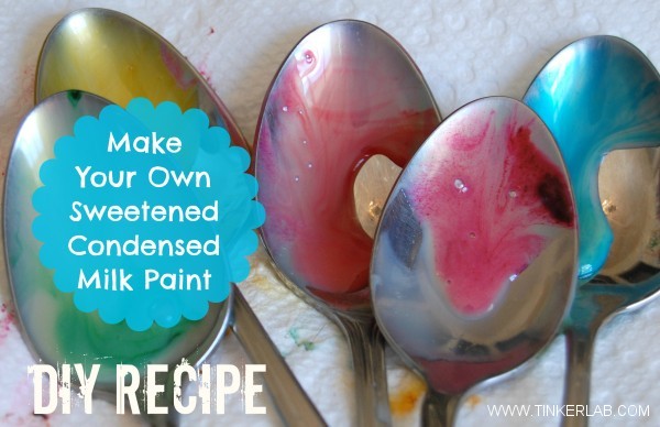
There is a milk paint that uses sweetened condensed milk.
Ya, really! 

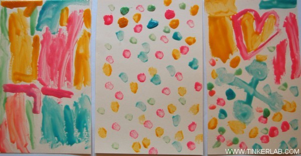
The recipe can be found at Tinker Lab

I don't recommend it for your furniture ;)
But, your kids might enjoy having some fun with it on paper.

It's for kids painting
(and eating if they desire)


 sweetened condensed milk paint diy from tinkerlab
how to make sweetened condensed milk paint


---

Well, there is so much info in this post that I decided not to add my projects completed with chalk paint.  I'm saving that for it's own post.  It's coming up next!


Sunday, September 15, 2013

Here & Now (Procrastination)

10 Easy Steps to End Procrastination
By: CJ Ramsaran  / at CJ & CO 


We all have tasks we need to complete; some more urgent than others; but for whatever reason, we seem to put these tasks off for later; for another time; another day; another year; sometimes indefinitely.  They just never seem to get done.
If you’re not careful, procrastination can slowly take hold of you; ultimately getting the better of you!  It can build barriers and limit your successes as well as hinder the realization of your goals and dreams.

Success can be yours by putting an end to procrastination.  The only sure way of doing so is by taking action now! 

Click HERE to read the 10 Easy Steps to End Procrastination.


 --------------------------------------------------------------------------------------------

"All of us will need His help to avoid
 the tragedy of procrastinating what we must do here and now to have eternal life."    
- Henry B. Eyring full article HERE


Saturday, September 14, 2013

Garden Beds


I do have garden beds, but I don't have the little seat area on the ends like this.  It's a great idea.
 
From Family Fun June 2006 magazine


I think the top seat area would help hold it together better and be awesome for a great place to sit while weeding the garden.

One thing I have learned (the hard way) is that garden beds shouldn't be very wide.  It's too hard to weed in the middle of the box if they are too wide.

Here is a picture of our garden boxes, found in our scrapbooks - taken about 12 years ago.


Harvesting from them can be kinda fun!


 The look has changed since 2001.
I'll have to try for a photo next year, because I'm out of time this year.


Thursday, September 12, 2013

Wedding Decor

We had some time to kill one day while waiting for an appointment, and enjoyed looking at some wedding décor.
 
We took a few pictures to remind us of the looks we saw. The photos aren't very good - we were using a phone and just sitting and visiting while we snapped a photo here and there. We just wanted to remember the look not take a perfect photo.

 
In this photo we liked the crystal garland (not the bigger white garland, but the smaller double swag behind it).
Though not very noticeable, there is a gazebo (with some greenery) in the left of the photo, and we really liked that too.


This next photo shows a large bookcase or shelving unit with decorative hooks attached to the upright boards and a chandelier hanging from one of them.  I liked that idea, and it looked better in the room than it does in the photo.
Another thing in the next photo is the white bark branches - they too looked better than they do here.
 

We also liked the painted cement floor seen in the above photo and this next photo. (sorry, phone photos just can't make the look as appealing as it really is.)
 

Then there was this backdrop - quite lovely.
 

The sheer fabric had been sewn to create vertical tubing or casing all the way across the width (with the seams running vertically). Then each tube had a strand of lights threaded through it. 
(I probably didn't explain that very well.)


It looked quite lovely when it was plugged in.

 
These were just a few looks we wanted to save because they were so lovely.
 
More lovely looks for weddings or other special occasions can be found here on my blog under the labels


Another place for great wedding or special event décor would be found under other labels such as


you might even check things like
 
Balloons  and
 
 
My pinterest boards offer more ideas - take a peek at my 
 
 
and
 
 
and


Wednesday, September 11, 2013

Happiness Is ...


something you design for the present.


Happiness Is Not Something You Postpone For The Future…
image from here


Tuesday, September 10, 2013

barn quilts


While traveling through Tillamook Oregon for our family reunion this summer we passed several barns with (wood/painted) quilts on the front or side.   Each was different and each seemed unrelated to the other.  It was interesting to see and I wondered what inspired so many to create and display these barn quilts. 
 
After we got home, my husband was going thru the mail and found a newspaper - The Bridge TV Week - with an article about Barn Quilts in the Kittitas County (WA state).  Because we had just seen and talked about this type of thing it peeked our interest and we read about it.
 
That article said; "A barn quilt is a painted replica of an everyday quilt on an 8-foot by 8-foot square of ultra fine-faced plywood..., some are 4x4."  (I didn't notice that all the barn quilts we saw in Oregon were the same size, but they probably were.)  "It is usually mounted on the most visible gable end of the barn."
 
I really love this barn!  The entrance is great!
The quilt is okay too, but the barn is the reason I am saving this look.
Everything else is just extra info. ;)


Continued info about barn quilts from the article:
"The designs are taken from traditional patterns used by quilters.  Favorite old family patterns are used, as are modern variations of traditional patterns."
"Barn quilts are a good way to bring attention to our way of life ..., they cause people to get off the main highways and tour the agricultural areas.  Some of the quilt patterns tell the history of the family.  Others tell what a farm produces."
 

Monday, September 9, 2013

Yard Tools Side Shed

I think this is a great storage shed / space
from a Sunset magazine, but I don't know what issue.


I have a plan to put something like this on the side of my pump house out by my garden.  I don't know when it will get done - it won't be this year - but I would love one there someday. 

 
Related Posts Plugin for WordPress, Blogger...